Website Design with Cari Schindler
I am so excited for you to read this new blog from my friend Cari! If you missed it, Cari is a brand consultant and graphic designer friend of mine who works with small businesses here in Tacoma, WA. She’s been guest blogging here for the past couple of weeks!
Last week I wrote an overview of designing your brand and explained many of the branding elements that go into a brand design project with my clients, including the brand guide. This week I want to take a look at one big, critical, impactful element of your small business brand: your website.
There are myriad options out there for designing, hosting, and managing your small business website. I typically recommend my clients choose a modern, user-friendly Content Management System (CMS) platform that will also register their domain and host their website. Some good choices are Squarespace, Shopify (if your business model includes an online shop), Wordpress, Wix, or Weebly (which connects to Square Point of Sale (POS) systems). You can also just design and manage your website content on these platforms and choose other platforms for domain registration or hosting, but I’m a big proponent of simplifying life for small business owners as much as possible, so if you can have everything on one platform, do that.
With each of these CMS platforms, you’ll find different membership tiers with varying prices and features, and capabilities. If you have no budget for a website, I don’t recommend using one of the “free” CMS platforms or “free” membership tiers. Typically these will mean using their domain name and featuring their advertisements on their website. There may also be lesser-known CMS platforms out there offering free websites which carry risks of getting scammed or hacked. Stick with the “big name” platforms like the ones I mentioned above, or do your research very carefully. If you have no budget for a website at the moment, the best free option is to register your business for its own social media accounts. In fact, even if you do create your own website, there are very few exceptions to the rule that businesses and organizations should be on social media. Which social media platforms you should be on, what kind of profile you should be presenting, and what kind of content you should be providing, are all determined by those bigger picture, “What? Why? Who?” questions that we discussed last week. If you’re not sure what type of social profile you should be creating for your business, that might be a sign it’s time to invest in some brand consulting. So, assuming you’re feeling confident about your social media accounts and you’re ready to move forward with creating a website on a CMS platform, how do you actually go about designing your website?
Always start with content first. I find it helpful to plan all my website content on paper so I can sketch out layouts (and so I don’t get distracted or stuck thinking about finished details) but use whatever note-taking approach you’re comfortable with. Write down each page that you think needs to be on your website, and then bullet or list (or write full paragraphs if that’s your thing) all of the content that you think will need to be on each page. Examples of content might include: headline, summary paragraph, promotional feature, call to action, recent blog post, social media feed, downloadable content, video, image, contact form, product listing, resume, portfolio or image gallery, or external link to another website.
If you’re not sure what type of content you need on your website, start by looking at the websites of similar businesses or organizations. Do they all have single page websites with only basic information? Do they all have blogs? Online shops or online donation or payment functionality? Of course your brand is unique and should dictate where to align with industry standards and where to break from them, but this is a good jumping off point. If you’re still not sure what type of content to include on your website, this is another indicator that a brand consulting appointment might be helpful to you.
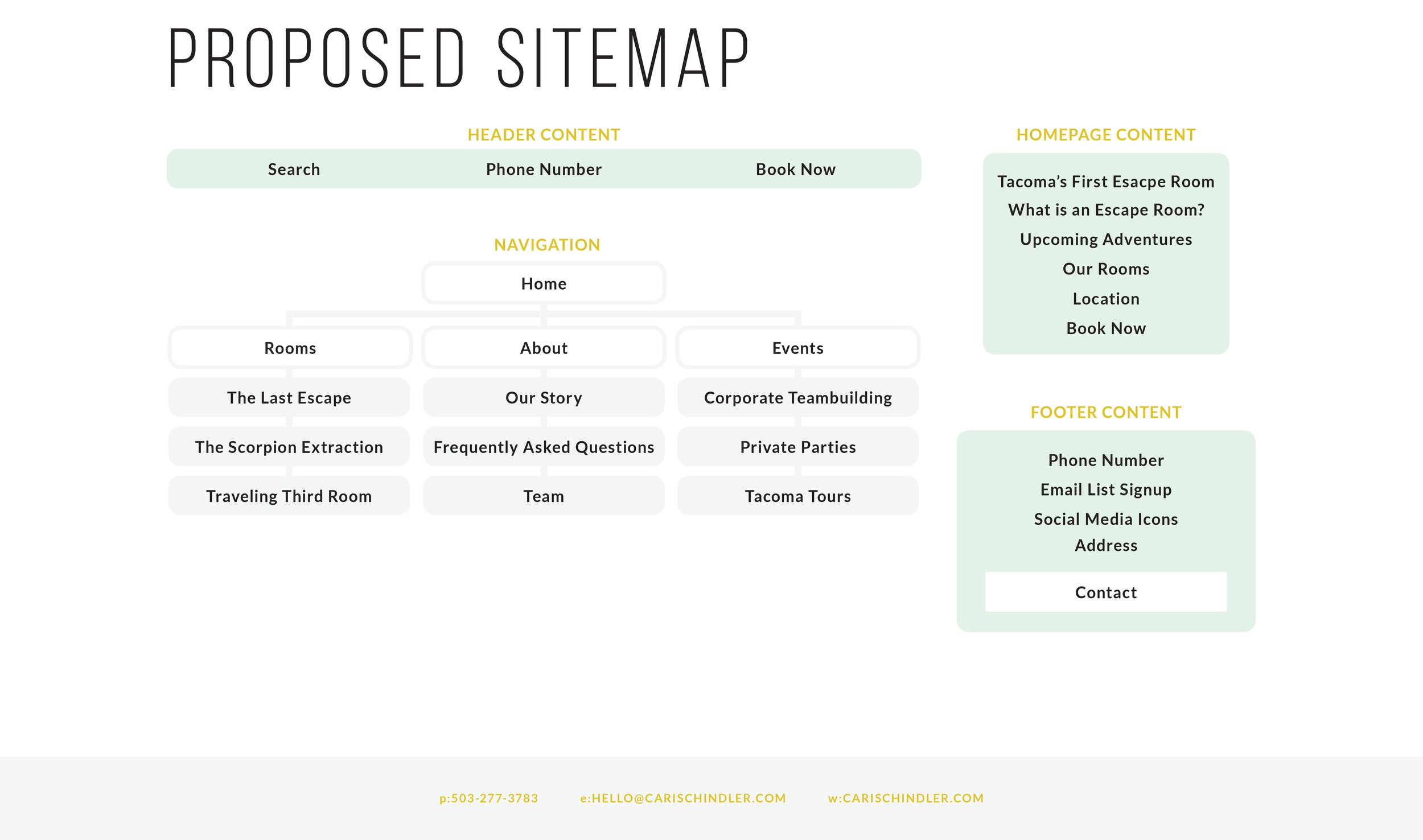
Once you have a list of the pages you’ll want on your website and a general idea of what content will live on each page, you’ll need to organize them based on hierarchy and how many clicks you want your website visitors to go through in order to access those pages. Use lines or arrows to show which pages link to each other. This is called your sitemap.
Sitemap Example
After you have your site map in place, it’s time to start designing. At this point, I don’t jump on the computer quite yet. While I’m still in my sketchbook, I like to draft a rough design of how the website should look. I draw boxes to decide how I’ll arrange my various content on each page. This is called wireframing.
Once I feel that the content is arranged in an intuitive, organized, and balanced way, it’s time to start making it look good. Depending on which CMS platform you’ve chosen to use, you’ll have access to different themes or templates and different design tools. If you consider yourself a website design novice, I recommend Squarespace. They have beautifully designed templates and they make it kind of hard to “customize” yourself into a corner. If you’re more comfortable with playing around on the back end of a website, look for a CMS that will allow you to tweak CMS or inject lines of code or install plugins to make your website exactly how you want it. Wordpress is great for this.
Website designed by Cari for The Practice NW
As long as you already have a brand guide, the rest of the aesthetic decisions should be relatively easy for you. Use the brand guide to choose colors and typography and photography. If you don’t have your own photo library for your brand, a photoshoot is a worthwhile investment. In the meantime, some stock photography might serve as a placeholder, just make sure you’ve sourced it legally and it fits the parameters outlined in your brand guide.
Even if you’re starting with a template, you will probably run into some judgment calls as far as design goes. Should this text be dark over a light background or light over a dark background? Should the button stretch to the full width of the column or just stick the size of the text in it? Should this type go over the photo or next to it? Should you use an overlay on this image? Spending some time finding and analyzing other websites that you believe align with your brand aesthetic should help provide some clarity. If you’re still getting stuck trying to decide, or feeling paralyzed by all of the options, that might mean it’s time to hire a designer to consult with on your website design. And, of course, if all of this just sounds too complicated or too much of a time commitment, you can also hire a website design professional to handle the whole process for you.
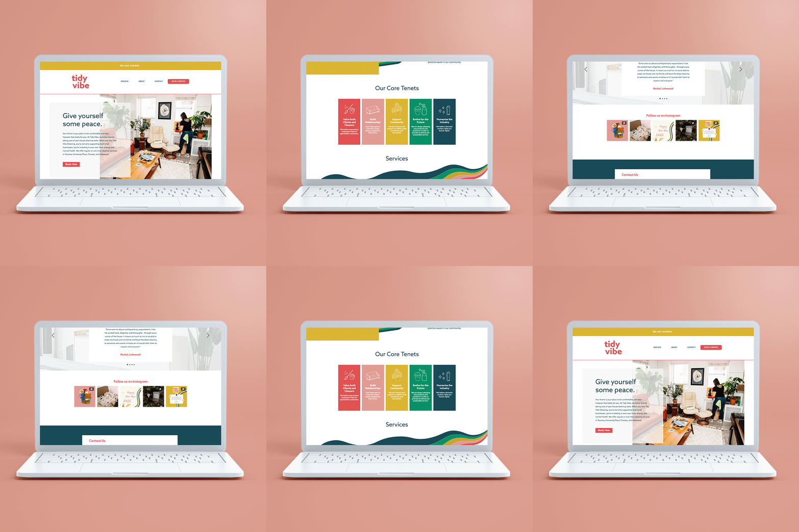
Website designed by Cari for Tidy Vibe Cleaning
When a client hires me to build them a website, the process usually looks something like this:
Branding (if it hasn’t been done yet or needs to be revamped)
Consulting on specific website needs.
The client fills out my website design questionnaire.
The client provides content, image library, and any relevant logins, etc.
I create the site map, and wireframe, select a platform based on my client’s needs, register a domain, gather visual inspiration, select a template or theme if applicable, customize each page, connect to social accounts or POS systems, and tie up any loose ends.
Live online training to empower my client to manage their own website to the extent they want.
Launch!
Promote!


