Designing Your Brand with Cari Schindler
Last week I introduced my friend Cari to you and our new collaborative blog series: How to prepare your brand for launch. I’d like to thank Cari for writing this second article in our series.
I’m really excited for this blog series to share a little bit about launching a small business, and this week’s topic couldn’t be more fun for me.
Designing Your Brand
Before we jump into specifics about how to design for your brand, let’s talk about what even is a brand. It can be a confusing term, as people tend to use it to mean a variety of things. In this blog post, I’ll be working from Marty Neumeier’s definition: “a brand is a person’s gut feeling about a product, service, or organization.”
As you can imagine, that means your brand is something you can only partially control. Your brand is decided by your audience’s perception, and part of that will always lie with them and the experiences they are bringing with them into any given interaction with your product, service, or organization. But there are elements of your brand that you can control, and it’s good to have as many of those elements keyed in as possible.
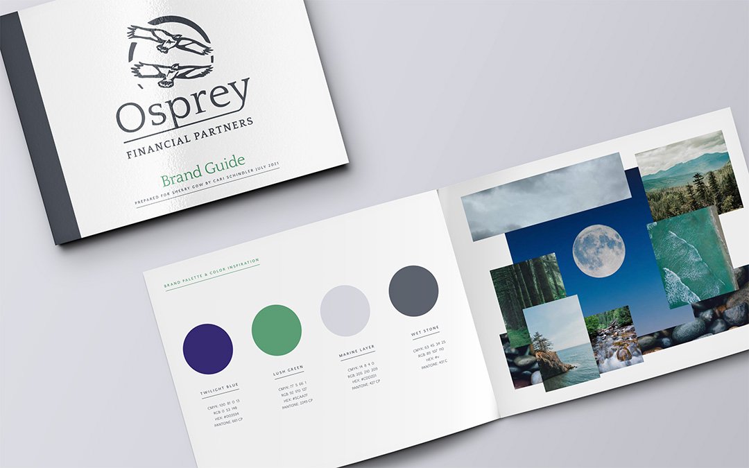
Some of those elements that I typically help my clients with are: brand story, brand values, brand messaging, brand aesthetic, logo design, color palettes, typography selection, and supporting visual elements. I never leave my clients without a brand guide that contains all this and provides some inspiration for how to put it all together across various digital and IRL applications.
This week, I’ll briefly explain what goes into each of those elements, (with a little extra information on logo design because it’s so fun) and next week we’ll take a closer look at website design, which is the second most common thing my clients ask me about, after logos.
Brand Story: This is a short paragraph that states exactly what your business organization offers and who it serves. For some of my clients, simply condensing all that they do into a few sentences feels overwhelming, and it’s helpful to them to have me look at it from an outside perspective.
Brand Values: These summarize the heart of your business or organization and can serve as both a compass to guide your branding decisions as well as a key differentiator from your competitors.
Brand Messaging: This includes a list of adjectives to guide the character (or personality, or voice) of your written communication, and some specific do’s and don'ts of language you should use when writing for your brand. I also try to sprinkle in some examples of brand messaging throughout the brand guide.
Brand Aesthetic: I usually create a list of adjectives that describe the look and feel of your brand, which can encompass everything from your product to your social media content.
Logo Design: This is what most people want to know about when they hire me. While a logo is not a whole brand, it is a critical part of a brand. Your logo should be a recognizable and memorable way for your audience to quickly connect the thing that your logo is on (your product, your packaging, your website, your employee uniforms, etc.) to your broader brand story and values, and therefore to the emotional connection they feel with your brand. Your logo should be designed with the previously listed brand elements already laid as a foundation, and it should be designed with the ins and outs of your business model and business plan in mind. What matters more than how you feel about your logo is how your audience feels about your logo. My logo design process for my clients always begins with these considerations, and only then moves on to the actual brainstorming, sketching, and refining phases. Occasionally, I’ll come up with all the logo concepts myself. But more often, my clients come to me with some brilliant ideas or inspiration already in mind, and I get to help them process their ideas and zero in on the key pieces of the logo. Sometimes sketches come to me on cell phone pictures of doodles on take-out napkins. Sometimes inspiration comes from a song or a vacation spot. In my logo design process, it’s all welcome and it’s all valuable.
Color Palettes: This is typically limited to 4 or 5 colors, although some of my clients have as little as 2, and some of my clients have had as many as 10. When I hand off a finished brand guide to a client, it includes the color codes for actually reproducing the colors across print and digital collateral.
Typography Selection: This is typically limited to two typefaces, although there are always outliers. I often include examples of how to format a typeface to get more mileage out of it. For example, you might use a medium weight at a large size in title case for a title, a medium italicized weight as a medium size in sentence case for pull quotes or subheads, and a heavy weight at a tiny size with extra tracking in upper case for buttons. (If that last sentence sounded like nonsense to you, no worries. I always walk my clients through the brand guides and explain as well as visually demonstrate as much as I can, so that they are empowered to design their own brand collateral moving forward if they want to.)
Supporting Visual Elements: Besides a logo, color palette, and type selection, some brands benefit from a library of supporting visual elements that help reinforce their brand. These can include patterns, icons, gradients, textures, etc.
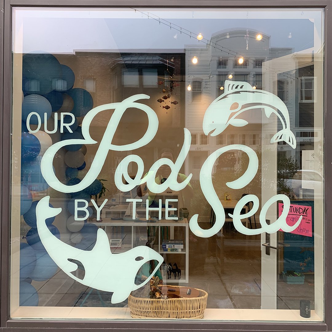
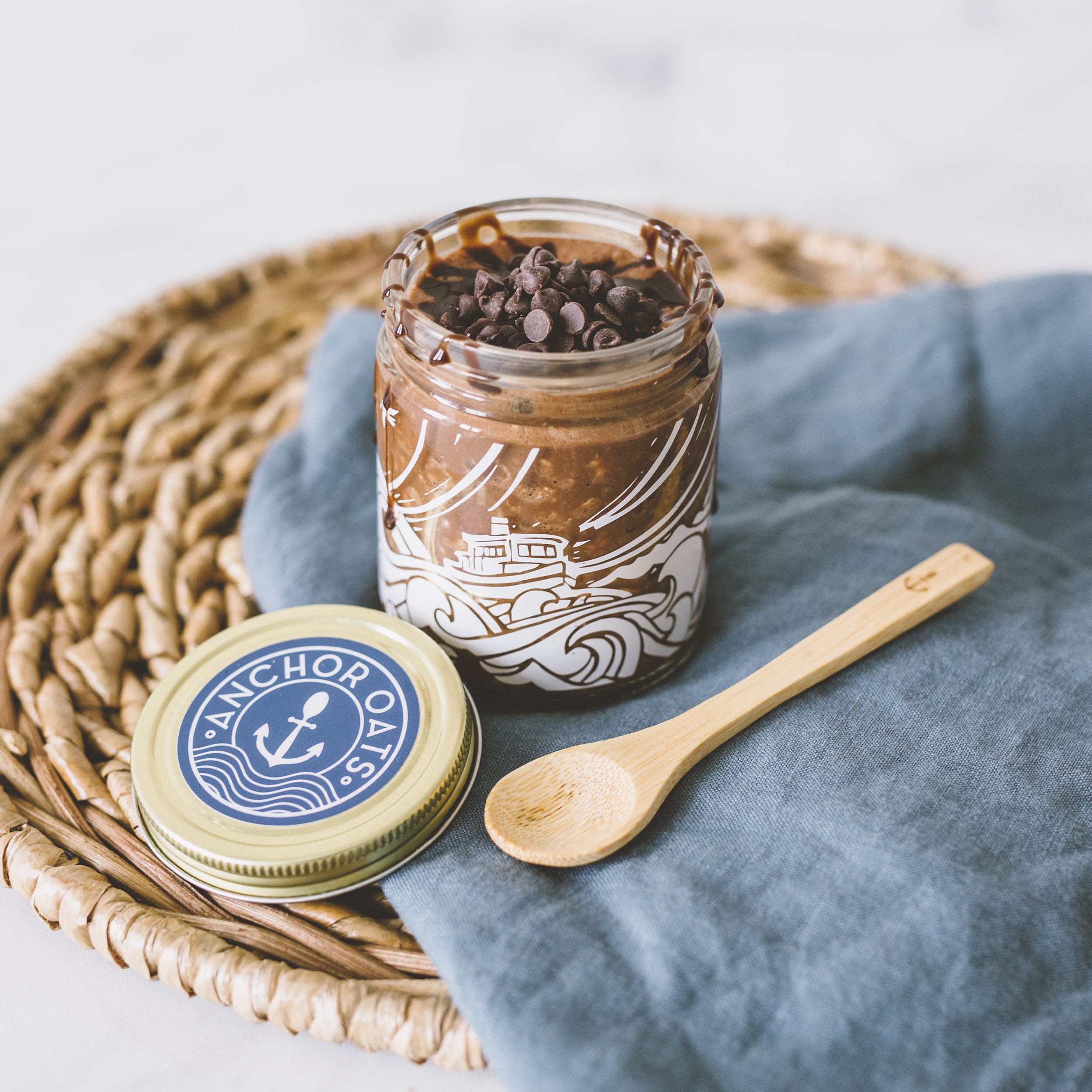
Below are some examples of Cari’s design work:


