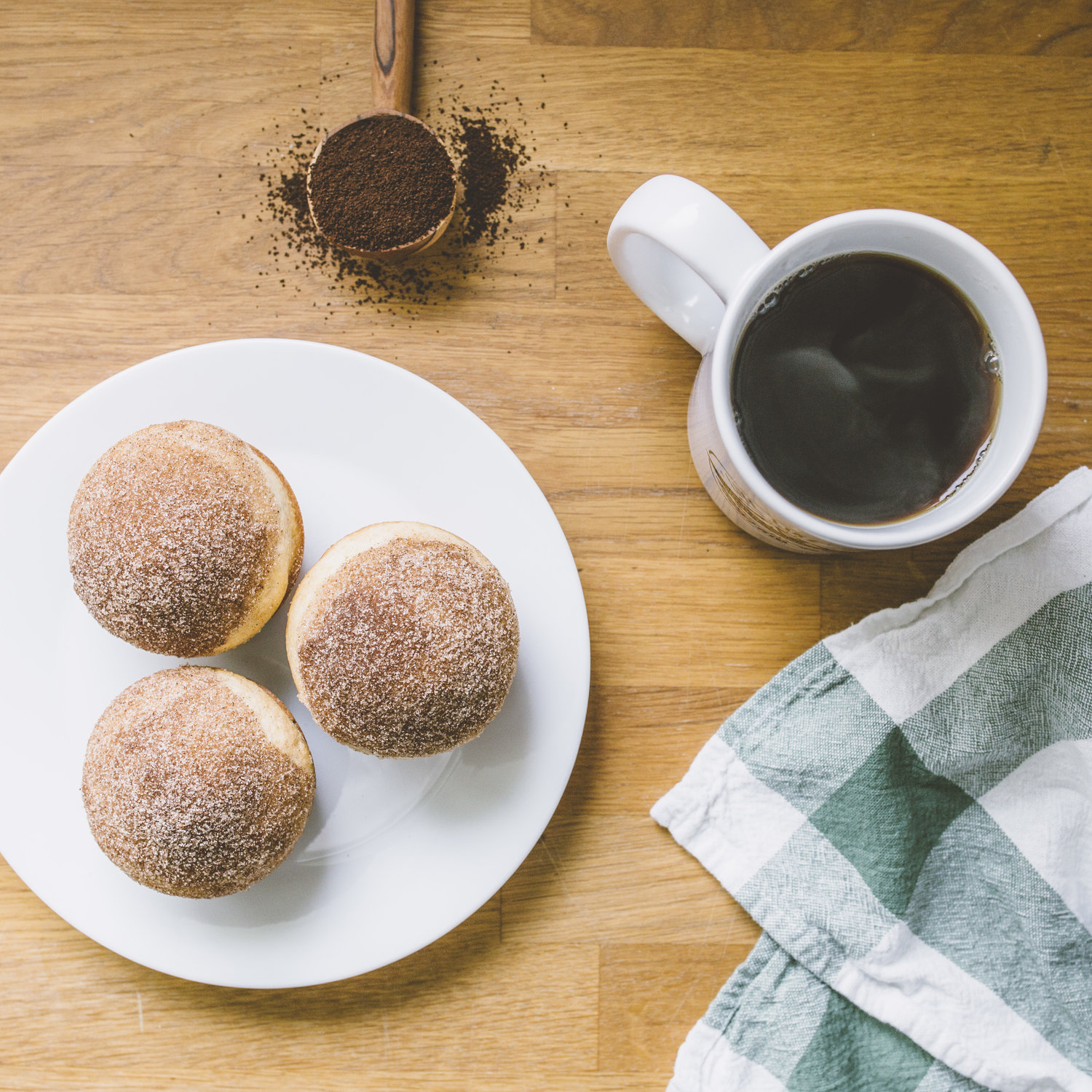
10 Tips for Shooting Flatlay Images for Your Brand
Have you ever tried to shoot a flatlay image and outright failed?
I’ve been there.
When I first started shooting flatlays they felt awkward and forced. Over time I have learned a few helpful tips that I want to share with you today.
Before we dive in just remember to take your time, practice and be patient with the learning process. The best way to learn is to keep trying (and failing) until you’ve got your own system down and feel confident in styling your shot!
1. Lighting:
Look for natural even light from a bank of windows or an overcast sky. I style my flatlays on my sunporch where I have plenty of even light pouring in through windows on three sides. If you’re getting too much shadow on one side of your scene, you can prop up a white poster board on that side to reflect the light back onto your subjects.
2. Background:
This is more simple than it looks! A white poster board or a roll of butcher paper make a great clean backdrop. You can also try vinyl backdrops, a leftover chunk of countertop, or a hardwood floor. My new favorite backdrops are from Replica Surfaces! Check them out!
3. Texture:
Texture is your friend. When picking your props find things with texture in them to make your shot more visually interesting. Texture also adds more depth to your photo. For instance, when I shoot flatlays with food I almost always throw a linen or dishtowel into the shot.
4. Layering:
Layers will also add depth to your flatlay photos. An example would be to layer a few notebooks on top of each other (slightly staggered) in an office flatlay. Or add a coaster underneath that cup of coffee.
5. Less is More:
Don’t over-complicate things and don’t be afraid of negative space! Choose a few props that tell the story you are going for. Too many props will feel cluttered so keep it simple!
6. Theme:
Pick a theme for your flatlay ahead of time and stick with it. A few examples of themes: things on my desk, travel, breakfast, a season or holiday. Make sure all your props fit your theme and tell a story.
7. Color Scheme:
Color is a powerful tool for flatlays. Pick a color scheme ahead of time or go with neutral with a pop of color.
8. Composition:
Don’t forget about your basic rules of composition. The rule of thirds and leading lines are especially powerful when it comes to styling your flatlay.
9. Hands:
A flatlay doesn’t necessarily only have to be made up of inanimate objects. Sometimes an extra set of hands (or a tripod) helps bring your flatlay to life (literally ;) For example sometimes I will have someone hold a cup of coffee or write in a notebook for my flatlays.
10. Rearrange:
When one thing doesn’t work don’t be afraid to try rearranging your frame. Often times I rearrange my flatlays several times before finding the perfect composition.


