Tips for Styling and Shooting Office Flat Lay Photos
A flatlay image is basically any photo taken from a bird’s eye perspective. Usually they are styled with some sort of theme for the contents. They have been made popular by Instagram influencers and are a great tool for promoting your brand too!
Today I’d like to share some tips for styling and shooting your own office flatlay photos for promoting your brand on Instagram.
First of all, it’s not necessary to have a DSLR to shoot a flat lay but if you are using a DSLR make sure you use a larger f/stop number so that you have more depth of field to work with. That way all of the subjects in your flatlay can be in focus. I like to use f/5.6 if I have enough light to accommodate for it.
If you are using your phone, a handy tool is the grid function (think back to art class and the rule of thirds). I also recommend changing the format to square before shooting so that you can see how the photo will look on Instagram. And lastly, turn OFF portrait mode so that everything stays in focus.
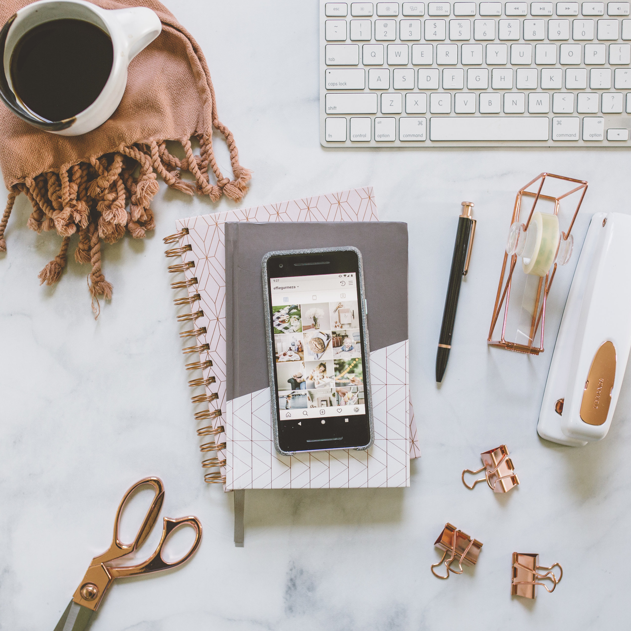
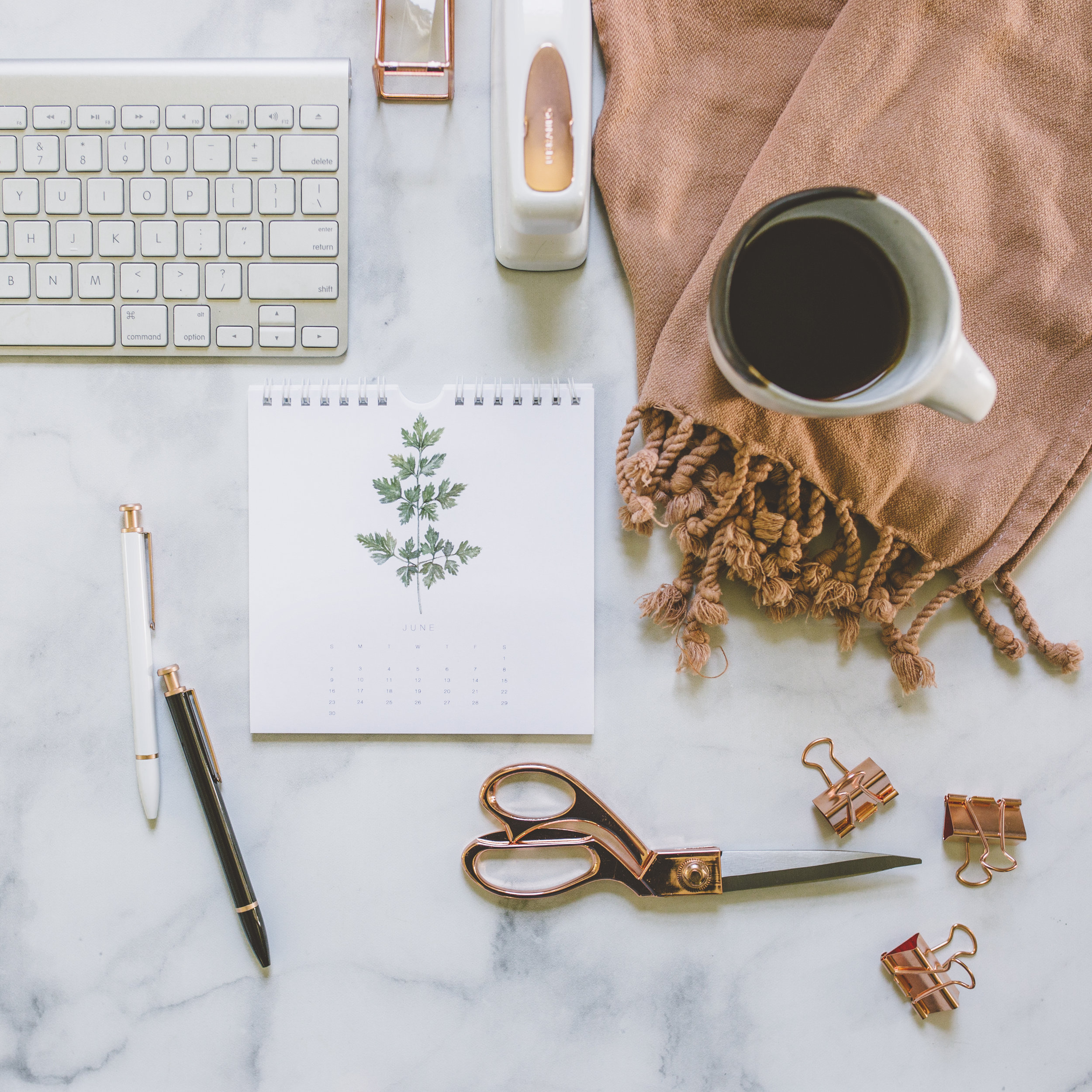
For office flatlays the idea is to make it look like your desk or workspace so first of all, gather some cute office props. For example, I have a box of props that includes a nice calendar, pretty scissors, a cute stapler, nice pens and pencils, pretty notions like paper clips and binder clips, etc. (things I don’t actually really use, but are pretty for styling). In addition to these, I like to have my planner, notebook, laptop (or a disconnected keyboard and mouse) and phone handy. Oh, and a cup of coffee of course! Sometimes it’s even nice to have a succulent or bouquet of flowers that you can throw in a shot for a pop of color.
I use a vinyl backdrop on the floor, but you can use any sort of backdrop including the floor itself (as long as it’s pretty), or your actual desk (if you are exceptionally tall or have good balance and can stand on your chair!). Just make sure you have really good indirect light wherever you are.
Now comes the fun part: styling your photos! Don’t be afraid to throw all your props out on your backdrop and rearrange them until they look pretty. Typically I start with a lot of things out and pair them down until I get the simplicity I am looking for to match my brand aesthetic.
This brings me to some composition tips for your flat lays:
1. Use a notebook or file folder as a base layer to add depth, texture, and interest to your photo.
2. Use pens and office notions to create leading lines that draw your eye into and around the photo.
3. Let things spill out of the frame. It creates mystery and interest. (Plus, we don’t actually need to see your whole keyboard…we get the idea from a few rows of keys!)
4. When in doubt, simplify!
I hope this post was helpful to you! If it was, please let me know in the comments below! I am excited to see your office flatlay images! Tag me in them on Instagram and tell me what you learned!


