How Brand Visuals Help to Build Brand Identity: A Case Study from Mars JOMO Snacks
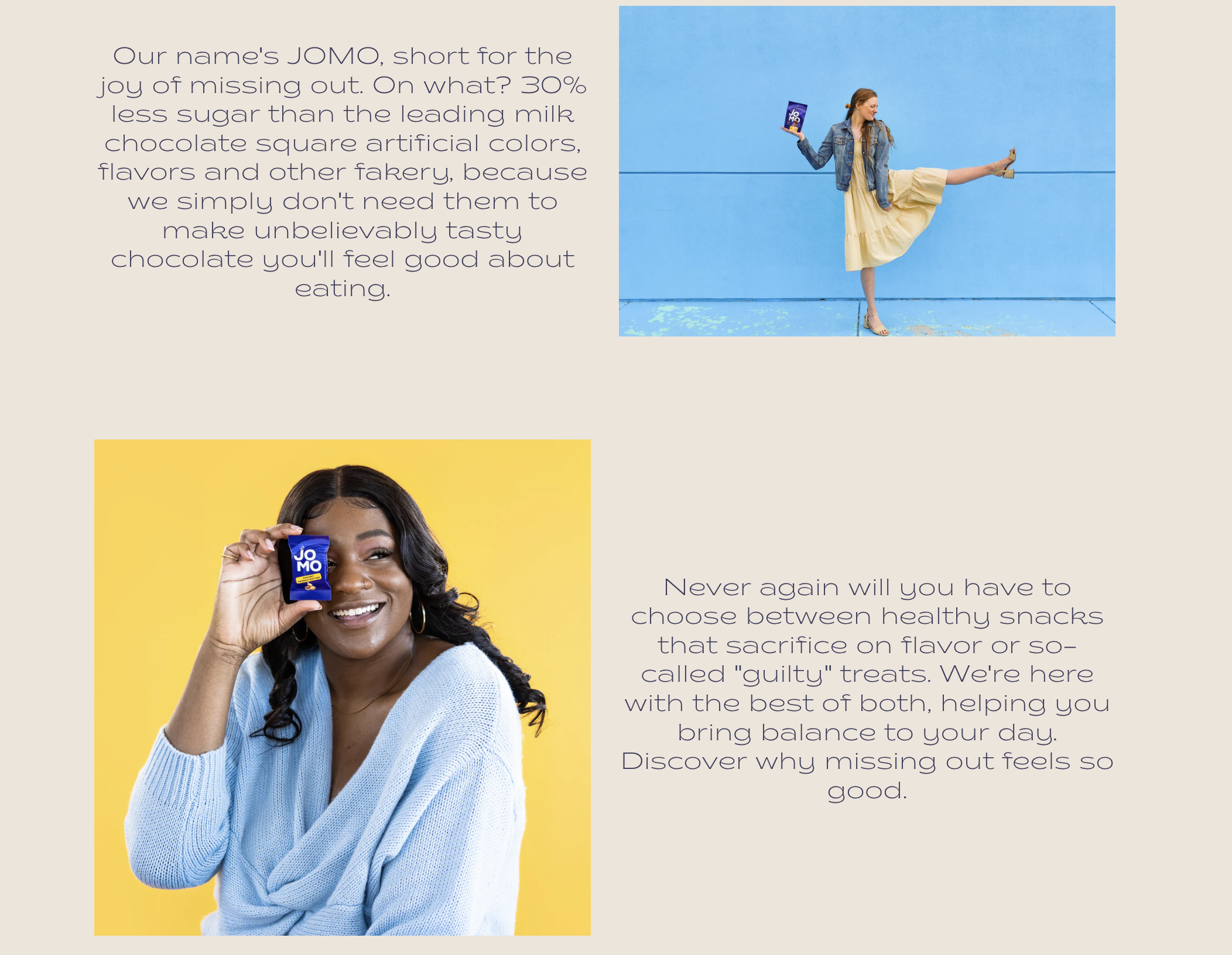
Screenshot from the JOMO Snacks website homepage. The top image was created by fellow creative, Caroline Ferrell, and the bottom image was created by me with model, Rhoda Baker.
I recently had the opportunity to help create brand visuals for a brand new line of Mars, Inc. chocolates, called JOMO Snacks.
JOMO stands for “Joy Of Missing Out” - the sugar and artificial flavoring that is! Their website states, “Finally, you can enjoy the chocolate you love without the so-called "guilty" aftertaste. It's hard to believe, we know. But it's true. From now on you can fill your days with balance. And feel the joy of missing out.”
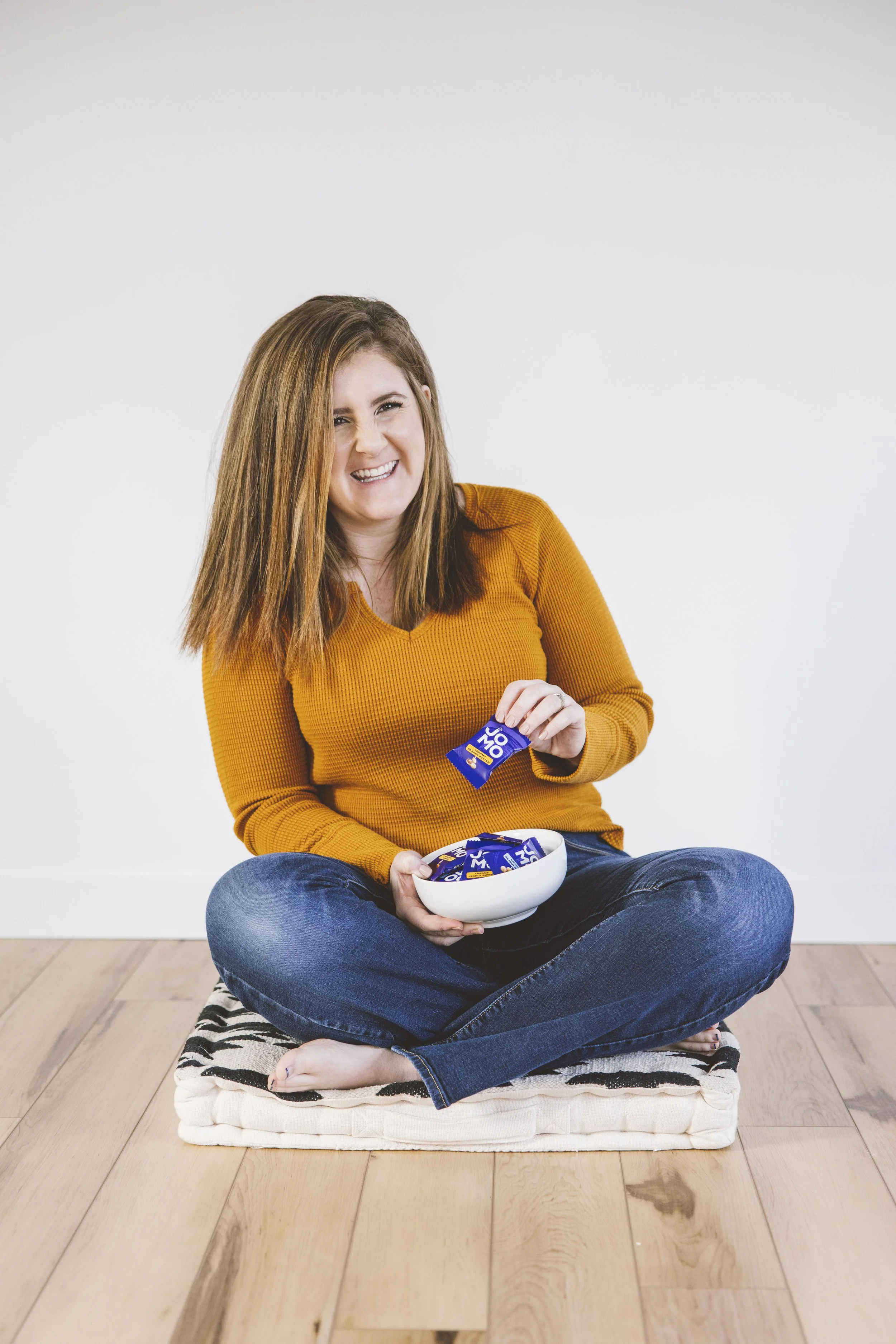
That joy and balance are what they wanted to portray in their brand imagery. They asked for joyful and playful images using their brand colors of deep purple, marigold yellow, and light blue, that depicted people enjoying their chocolate snacks in lifestyle environments and on colorful backdrops.
I was able to collaborate with a few models and other fellow creatives around the country to create a super fun gallery for Mars to launch JOMO snacks into the world and I am so excited to share some screenshots from their website and social media to show how that imagery is playing a big role in their brand identity.
Screenshot from the JOMO Snacks website product page with image I created with model, Rhoda Baker.
Screen shot from the JOMO Snacks Instagram page. Can you spot the three images that I created? Top row left, second row left and bottom row middle.


